Spring 2016 Project2-OpenDataNYC Summary
Project 2 in Spring 2016 invites students to think like a product design team to leverage interesting public data sets found from NYC open data portal. Using three weeks, the students went through the development cycle of design, planning, implementation and analysis. The presentations were given in the form of a product demo.
Spring 2016 Project 2 Open Data NYC
A shiny app learning experience using NYC open data
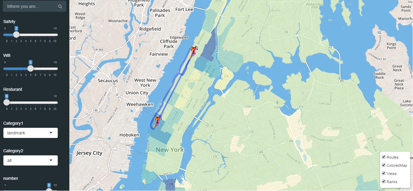
Team 1: NYC Trip Planner
Main ideas
This shiny app intends to help the user at Columbia better organize their trip in New York. The three factors considered here are safety, wifi and restaurants, each of which having a measure to manipulate. Once the weights are set, regions of New York on the map will be colored differently to show the integrated score. Then, if the user clicks any place on the map, he will see the score of each factor of this landmark or museum. Also, different routes from Columbia to the destination will be provided.
- Selected screenshot:
Critiques
- interesting techniques include designing routes between two points on a map, which is realized by the “orsm” package in the app.
- potential improvements include more explanation of different colors on the map chart.
- it is good idea to consider the three factors together when planning a trip, but how they use the measure is unclear.
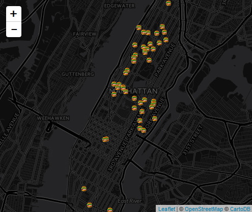
*Team 2: Rats in New York City
There is something wrong with the R files of this group. I can see the main structure of user interface and the interactive charts saperately, but cannot combine them together. Worse, there is no error alarming by R studio, which disables me to debug. So that the summary of this group is based on the limited information I can get from the app.
Main Ideas
This app is intended to explore the rats in New York city.
- First of all, as an introduction, the time distribution of rats number in NY is plotted in a histogram.
- Then, in the section of data analysis, a map chart is plotted to show the space distribution of rats. Also, the space distribution of restaurants is showed on the map chart to find the correlation between them.
- Selected figure:
Critiques
- Interesting topic.
- Badly-organized code files.
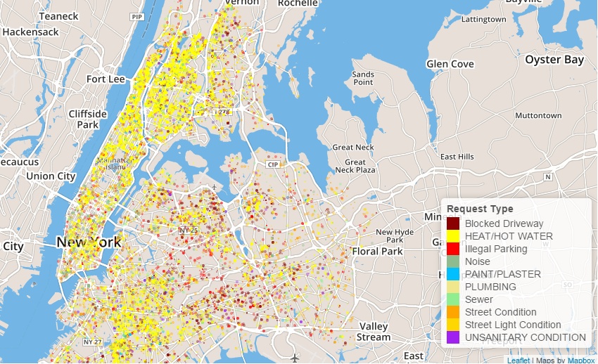
Team 3: 311 Requests
Main Ideas
This shiny app is based on the dataset of 311 requests in past few years, and realized interactive visualizations from different perspectives.
- The first three sections provide an overview of all the 311 requests. The first section, Interactive Map, shows the distribution of the requests over different categories and districts by a map chart with points of various colors. Then, the second section, Abnormal Detection, uses a line chart to display the variation of different complaints across the whole year, i.e. the distribution over time. Moreover, the third section, Word Cloud, visualizes the frequency of each kind of complaints by a word cloud, as indicated by the name.
- After the overview, the forth section, Bar Chart, enables the user to take a closer look at the complaints in his zipcode area. The bar charts showing the composition of complaints in each month are available.
- Finally, in the last section, it is very considerate of this team to show the data set structure and tools used in the app, so that we can have a clear knowledge of the whole map.
- Selected screenshots:
Interactive Map for Different 311 Complaints in New York
 Data Set and Tools
.jpg)
Critiques
- showcased excellent use of different charts and plots.
- a clear and accurate visualization of one certain issue, 311 requests, from different perspectives.
- potential improvements include making some of the plots more interactive.
Critiques
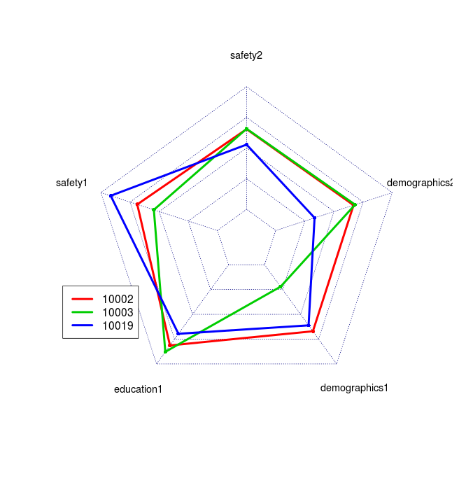
Team 4: Find Your Place
Main Ideas
This app aims at providing a zipcode-level recommendation system for the person who wants to buy a house at Manhattan. The four factors considered here are education, safety, entertainment and demographics, which are the concerns of most residents. The app is made up of five components:
- First, and the most important, is the recommendation section. Based on the weights set by the user, this section can choose the top 10 most suitable zipcodes for him.
- Then, for each factor, there is a section to visualize its distribution at Manhattan and set its weight.
- Selected figure: Spiderweb Diagram for Different Zipcodes
Critiques
- an flexible interactive system, utilizing the strength of shiny app.
- potential improvements include more explanation of how weights act on the final choice, the standardization of each factor and the source of data used.
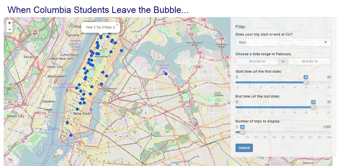
Team 5: Columbia Taxi
Main Ideas
This app provides a visualization for the yellow cab data, of which arrived at or departed from Columbia University. The total price including fare and tips, and the pick up or drop off location of each trip are shown on an interactive map chart.
- In the section of user interface, we can choose the type, the period and the number of trips to display.
- Then, on the map chart, each location are denoted by a blue point with the information of fare, tip and ratio (tip/fare). Also, a scatterplot of tips and fares is plotted to show the relationship.
- Selected figure: Map Chart of Columbia Taxi
Critiques
- a clear structure and friendly user interface.
- potential improvements include more visualization of processed data, and using points of different colors to convey more information.
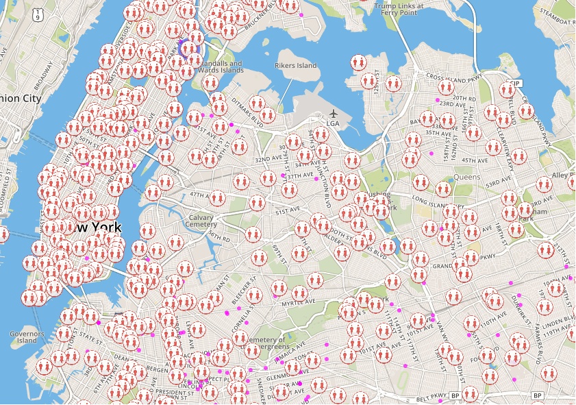
Team 6: DiDi Toilet
Main Ideas
This shiny app integrates the visualizations of toilet locations and criminal data.
- In the first section, it presents the locations of all the toilets in New York on a map chart, according to the toilet types selected, e.g. Handicap Accessible, Open Year Around. Also, criminal data are allowed to add into the map chart for users to better choose the toilets around.
- Then, the second section uses a dynamic map to show the variation of different felony incidents in 72 minutes of a day.
- Finally, the last section provides information about the team members, the inspiration, and the data source of the app.
- Selected screenshot:
Toilet Map with Criminal Data Added
Critiques
- valuable information and close to life.
- interesting skills include marks of user location on the map, and dynamic map showing the variation of felony incidents.
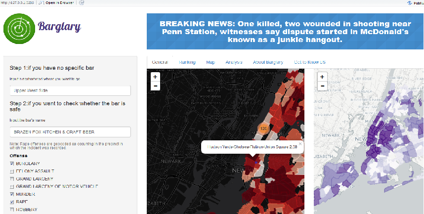
Team 7: Barglary
Main Ideas
This shiny app builds a recommendation system for the user to choose the best bar for him. The main concern here is safety. This app realizes its goal in two steps.
- First of all, the user can choose the neighborhood he would like to go to, and any type of offense information he want to visualize. Then, a map chart will be plotted to show the severity of that kind of offense in different parts of New York. Also, all the bars in the user’s preferred neighborhood will be marked on the map. Moreover, the user can find the detailed offense information and rankings of these bars in a large form.
- In the second step, after the user has made the choice, he will have a pie chart to see the composition of all crimes that happened there in 2015. In addition, an eternal link is connected with Google map to show the accurate address as well as many other useful information such as overall evaluation rate.
- Selected screenshot:
Critiques
- a clear, user-friendly and progressive structure.
- accurate visualization of useful information: the crime rates in different neighborhoods.
- potential improvements include more explanation on the second map in the section of General, and how the scores in rankings were calculated.
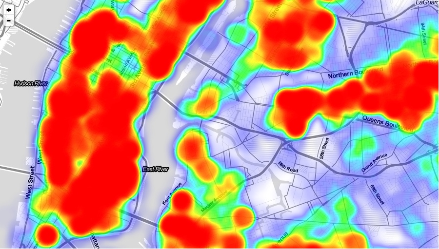
Team 8: Exploring NYC’s Water
Main Ideas
This shiny app intended to explore NYC’s water, and the team were focused on residents’ complaints on this issue. The app is composed of five parts: Main, Overview, Water Quality, Duplicates and Resolution Time.
- The first part, Main, is a static figure of different complaints about the water in New York, which gives the app users a clear first expression about the topic.
- Then, the second part, Overview, used a pie chart to describe the composition of complaints and a heat map to show the intensity of complaints in different regions. As its name shows, this part provides a big picture of the issue from two perspective: composition and space distribution.
- Following above, the third part, Water Quality, chose to take a closer look at one of the most populated points: water quality, and is made up by a word cloud to show the various descriptors used by NYC residents to describe water quality, a line chart to describe the variation of complaints over the last year, and a map chart about reported illness.
- Finally, the fourth and fifth part, presented the degree of complaint duplicates and resolution time, using bar charts, line charts and box plots.
- Selected screenshot: Heat Graph of All Complaints
Critiques
- a clear and well-organized structure.
- showcased excellent use of different charts and plots.
- potential improvements include more clarification about the map of reported illness, e.g. the number of reported illness in each district may be influenced by the population size there.
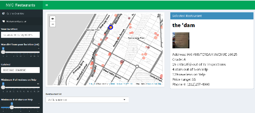
Team 9: NYC restaurants
Main Ideas
Similar with team 6, this app intends to build a recommendation system. But here the theme is about restaurants.
- In the section of user interface, the user are free to choose their location in New York, maximum distance from location, cuisine type and Yelp review requirements.
- Then, the app is able to show the pie chart of cuisine types at the user’s location. Moreover, a map chart is plotted to show all the restaurants that meets the requirements. By clicking the name of any restaurant, its Yelp reviews are also displayed.
- Selected screenshot:
Map Chart for Restaurants
Critiques
- valuable and accurate information.
- interesting skills include combining Yelp with the shiny app.
- potential improvements include denoting different restaurants by different colors.
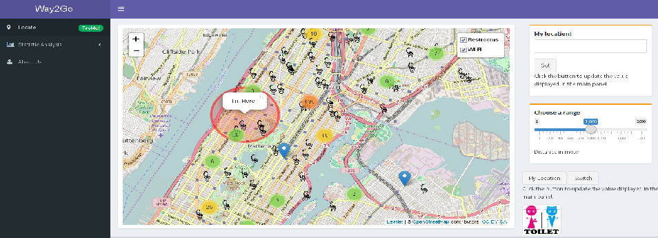
Team 10: [Way2Go]
Main Ideas
Same with team 6, this app also focuses on the restrooms in New York. While the difference is this app is more focused on data analysis than merely providing a finding-restroom-nearby service to facilitate our daily life. There are two items in the main menu:
- The first is Location. In this section, this app provides the location of the user, though not very accurate, and shows all the public restrooms in New York on a map chart. Also, the coverage area of free Wifi is shown on the map.
- In the second section, this team show some statistical analyses of the dataset. To start with, they compared the restroom density in different boroughs. Then, the relationship between restroom density, population density and income level were investigated. Based on the results, they made the suggestion that the local government in Queens and Brooklyn to build more public restrooms in the areas where housing price is low and population is high.
- Selected screenshot
Map Chart for Restrooms and Wifi
Critiques
- a recommending system as well as data analysis.
- not only considering restrooms in parks, but also the ones in other public facilities like public libraries, public hospitals, fast food restaurants and so on, which leads to more accurate information.
- interesting findings include the larger population in a region, the less public restroom per resident there can own.
Comprehensive summary
The 10 shiny apps of Project 2 can be mainly classified into two categories: intended for daily use (1,4,6,7,9,10) and intended for data analysis (2,3,5,8).
In the first category, I like App 7:Barglary best. If an app is designed for people to use in their daily life, then a major concern is how to achieve the balence of concise, clear user interface and abundant, valuable information. And I think team 7 performed best in this issue. Some of the apps only plotted the raw data on a map chart (e.g. 6 and 9), which is OK but can be better with more processing.
In the second category, I like App 3: 311 Requests best. The apps in this category actually did the similar job as in project 1, finding interesting patterns of the dataset and making visualization. But the difference is that with the aid of Shiny app, the visualization can be more interactive. I think in the perspective of results visualization and structure design, team 3 performed best.
Different from a report in PDF or HTML format, a Shiny app usually has fewer word descriptions. And it is a common problem of these teams that sometimes the information were not conveyed clearly by the figures without enough explanation, e.g. the meaning of different colors in a map chart.