Spring 2016 Project1-ACS Summary
Project 1 is about exploratory data analysis on 2013 American community survey. Students were invited to study Kaggle scripts (a.k.a, kernels) on this dataset and come up with their collaborative RMarkdown report. This summary was prepared by Chengliang Tang.
Team 1: Finding Life Partner
This project looked at singles and focused on two main ideas:
- First, the group explored the demographic profiles of the singles, in terms of gender ratios, age, employment, education status. Comparison between single men and single women was also carried out.
- Second part of project is a search engine for singles to look for “the one” based on one’s preference. It computes ratios of “potential life partners” (defined by the query) to the total population in different states, and generates recommendations using the top states. A similar analysis was also carried out for different industries.
- Selected figure: estimated percentage of single females that are between 16-29 years old, graduated from college, and have a job
Critiques
- a clear and focused topic.
- potential improvements include adjusting incomes by local living standards, selecting a better population proportion baseline and incorporating survey weights.
- showcased excellent use of ggplot2.
Team 2: How we live and how we work (Money, Money, Money!)
As shown by the title, this team concentrated on several money-related issues in the report:
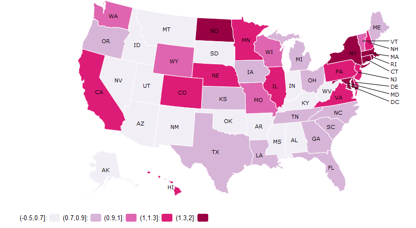
- First, the group computed the fraction of two popular employments, i.e. finance and technology, in each state and show the results in a map chart.
- Then, the group calculated the distribution of income, in terms of age, state, race and class of work.
- Finally, the relationship between arrival time at work and other factors like industry, state, income were investigated by a series of box plots.
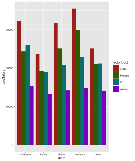
- Selected figure: Average Salary for Different Occupations
Critiques
- a comprehensive overview of money-related characteristics in ACS dataset.
- potential improvements include organizing all the parts under one topic, and providing analysis and comments after figures.
- the exploration of arrival time is interesting.
Team 3: Income disparities and so many of them
This team investigated many parameters on personal income. More specifically, the attributes of Location, Age, Sex, Race, Secondary Education, Disability, Work Hours and Travel Time as well as their effects on income were explored.
- In the first part, the group utilized different kinds of figures, like histogram, boxplot, bubble chart, etc., to illustrate the separate effects of each attribute over income.
- In the second part, a linear regression was conducted to quantitatively show the effect of each factor.
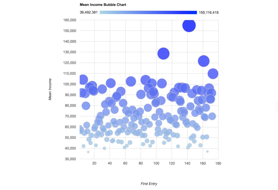
- Selected figure: Mean Income Bubble Chart for Each Degree Field
Critiques
- beautiful and informative figures.
- provided quantitative as well as qualitative results, while potential improvements include incorporating survey weights in linear regression.
- important findings: the effect of sex and disability on income is still remarkable, which agrees with our common sense.
Team 4: So now you are graduating with a degree in Statistics, what’s next?
As students majoring in statistics, this team intended to explore the current conditions and future development of those who graduated with a statistics degree.
- First, they looked into several important variables such as gender, education, employment, occupation and wage, to compare individuals with a statistics major to those with a finance, computer science or mathematics major. And the results appeared pleasing for students majoring in statistics.
- Moreover, focused on the group of individuals with a statistics major, this team explored the effect of education degree and location on income and job opportunities, and achieved the conclusion that pursuing a higher degree and then working in developed states like CA, NY and TX will be a good choice for them.
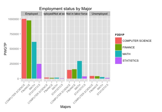
- Selected figure: Employment Status by Major
Critiques
- well organized into two parts, with a clear logical order.
- incorporated survey weights and used hypothesis testing to obtain statistically significant results.
- potential improvements include using the proportion of statisticians in the whole population as the measure when deciding best location for working.
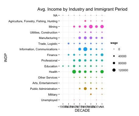
Team 5: The new Chinese on the block in US
This team focused on the group of Chinese living in the US, and examines many aspects of this group.
- To begin with, the group explored the demographic profile of the Chinese, in terms of age, marital status, location, income and working time.
- Then, in the second part, some detailed issues were looked into, including the income of Chinese master-holders, the distribution of wage over industries and periods in Texas, the gender pay gap of Chinese, and so on.
- Selected figure: Average Income of Different Industries and Periods in Texas
Critiques
- a comprehensive, descriptive analysis of the Chinese group.
- provided reasonable explanations for interesting phenomena found in data analysis, e.g. two peaks in the distribution of population over age.
- interesting finding: Chinese in Montana and South Dakota have the longest working hours and the lowest wage.
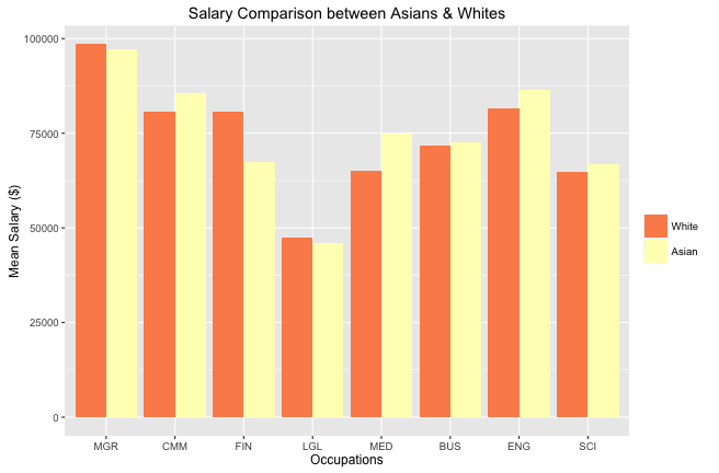
Team 6: Occupational wisdom
Inspired by a research of USA Today, this team explored the pay gaps between Asians and whites in high-paying industries, e.g. high-tech, finance and medical.
- First, they took a big picture to compare Asians’ and whites’ salaries in different occupations, and presented the result in a bar chart.
- Then, according to the bar chart, this team chose three occupations to take a closer look at: Computer and Mathematical Occupations (conflicting with research result), Finance (whites earn much more), Medical (Asians earn much more). The closer look include education background investigation and state-wise salary comparison.
- Selected figure: Salary Comparison between Asians and Whites
Critiques
- good report structure: a big picture followed by several closer investigations.
- interesting finding: In finance occupations, Asians have better education backgrounds, but earn much less than whites.
- incorporated replicate weights.
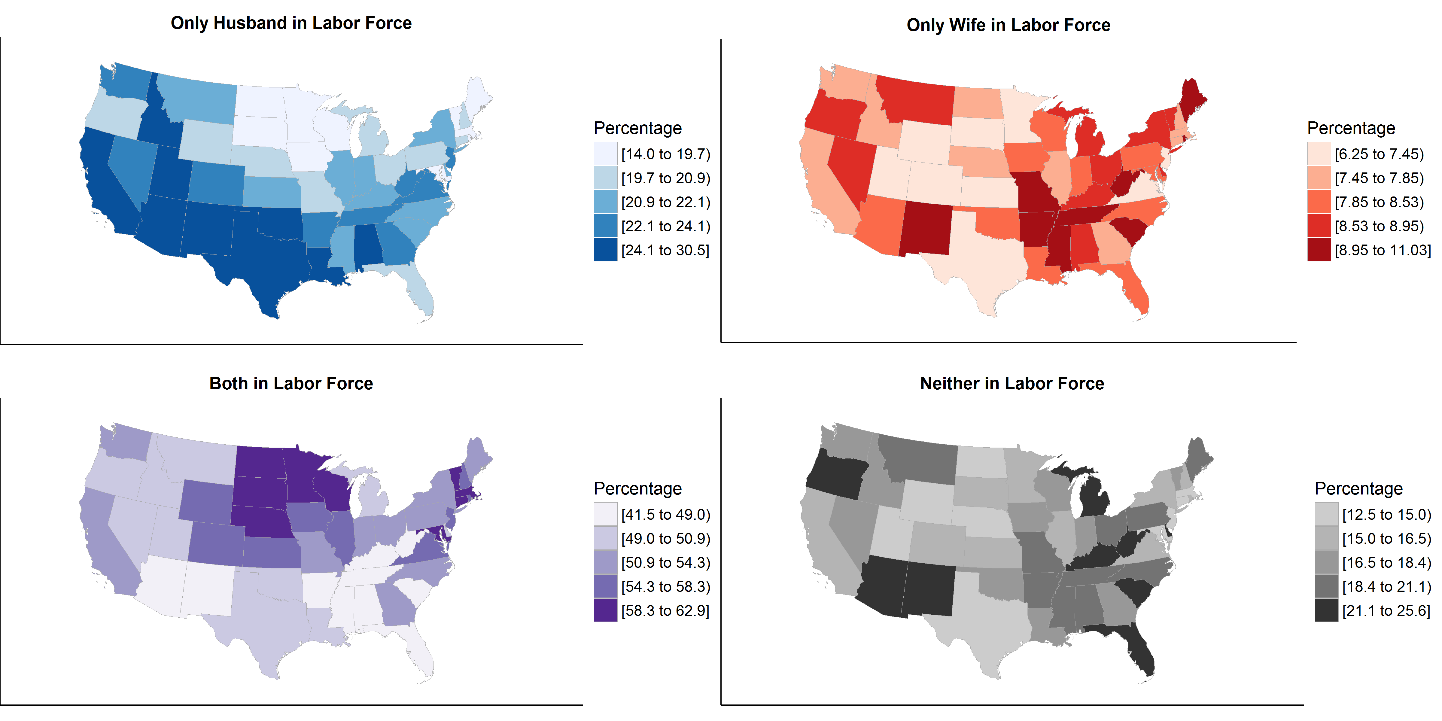
Team 7 He works and she works
This team looked at the income source of married-couple families, and focused on three main ideas:
- First, the team compared the family with only husband in the labor force and that with only wife in the labor force from three aspects: income, education level and occupation distribution.
- Then, they explored the proportion of different types of married-couple families and their distribution across the continental United States.
- In the end, this team were interested in the income source of the spouse not in the labor force and made an elementary comparison between husband and wife using box plot and bar chart.
- Selected figure: Distribution of Different Types of Married-couple Families across the Continental United States
Critiques
- the order of the first two parts can be reversed, since the second part is an overview while the first and last are comparisons.
- interesting finding: by comparing the distribution of different types of married-couple families across states, we can get useful information about the characteristics of each state, e.g. Florida is with lots of retirement communities so has high proportion of family with no one in labor force.
Team 8 Comparing post-graduate life in US.
This team intended to look into the life styles in different regions of USA, especially New York and California. The analysis is divided into four parts:
- First of all, they explored the current situations of migration of American residents. A chord diagram and a flow map are plotted to illustrate the issue.
- Then, they focused on three important components of after-college life: work, income and marriage. Comparison between New York and California was also carried out.
- Selected figure: Immigration Inflow and Outflow in Different Regions

Critiques
- a fancy presentation approach and many informative figures.
- potential improvements include adding more word description for the figures.
- interesting finding: the bar chart for transportation evidently showed the biggest traffic mode difference between New York and California (Subway vs. Car).
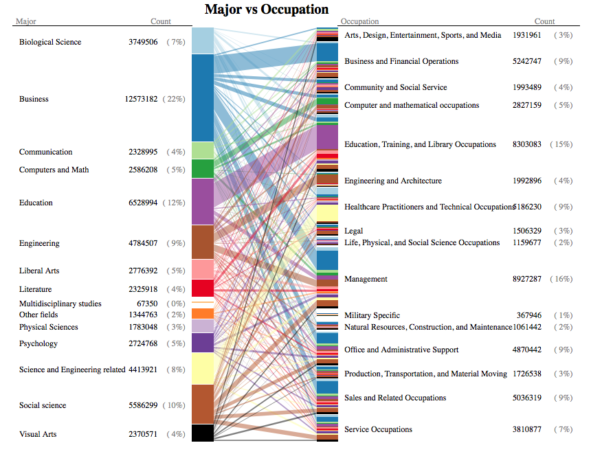
Team 9 Major matters? Am I stuck with my major for life?
Interested in the research problem “To what extent does one’s major determine his/her career?”, this team focused on the relationship between majors and occupations.
- First of all, the team utilized three different advanced figures -BiPart graph, circular graph, and bar plots- to show the occupation choosing of different majors.
- Then, they compared the wage level for different majors and conducted a t-test to show that having a computer science related degree helps one to earn more in the CS fields.
- Selected figure: Major vs. Occupation
Critiques
- incorporated survey weights.
- showcased excellent figure plotting skills.
- presented the big picture of occupation choosing of different majors, and potential improvements include taking a closer look at the flow from a certain major to another occupation, like from computer science to finance.
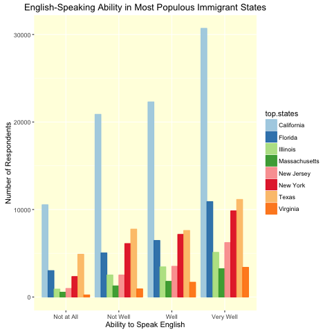
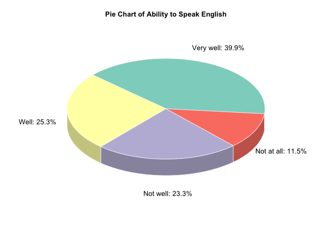
Team 10 habla Inglés?
This team focused on the group of non-English-speaking immigrants, and intended to deeper understand their language transition after arriving in the US.
- To begin with, they took an overview of the immigration in the US from two aspects, time and space. In this exploration, the distribution of immigrants over years and states were calculated. Also, the variation of gender ratio and age structure were looked into.
- Afterwards, the team took a closer look at the English ability of immigrants. They compared the English ability of immigrants in different states and also conducted a t-test to show that the non-child group have better English ability than their parental counterparts.
- Selected figure: English-Speaking Ability in Most Populous Immigrant States
Critiques
- the time series analysis of immigrants may be biased because some elder immigrants may have passed away, thus unable to fill in the survey.
- potential improvements include reorganizing the report in a better order, and adding possible explanations for the effect of child birth on parents’ English ability.